UI/UX design services measured on what people finish, not what they admire
Every product has three or four places where people give up, and they are knowable. Somebody lands and does not start. Somebody starts and does not finish. Somebody finishes and never comes back. Good interface design is mostly the unglamorous work of finding which of those gaps is costing most and closing it. UI/UX design services for teams across the US, UK, Canada, Australia and New Zealand.
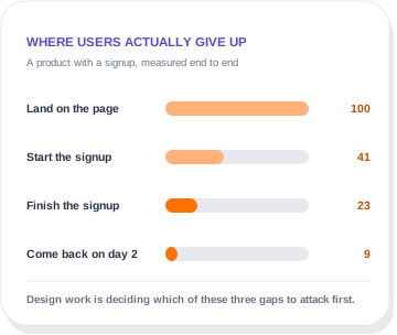
Where people actually give up
Any product has all three. The work is deciding which to attack first, and the answer is usually not the one the team is arguing about.
They land and do not start
Almost always a clarity problem rather than a design one. People cannot tell what the thing is, who it is for, or what the first step costs them. No amount of visual polish fixes a proposition nobody understood.
They start and do not finish
This is the gap design work closes most reliably. Too many fields, unclear progress, an error message that does not say what to do, a step that asks for something people do not have to hand.
They finish and never come back
The hardest of the three and the most valuable. Usually the product did not deliver a visible result in the first session, so nothing pulled them back. That is an onboarding design problem, not a marketing one.
What UI/UX design services actually involve
Six deliverables, and the first three are where the value concentrates. Projects that skip straight to visual design usually get rebuilt.
User flows before screens
Mapping the path from arriving to done, including the unhappy ones. Most interface problems are flow problems that got decorated instead of fixed.
Wireframes worth arguing over
Deliberately plain, so the conversation is about structure rather than colour. It is much cheaper to have the argument here than after everything is built.
Clickable prototypes
Something people can actually use before it exists in code. Five people trying a prototype for ten minutes will tell you more than a month of internal opinion.
A design system, not a pile of screens
Components, states, spacing and rules, handed over so developers build consistently and the product does not drift as it grows.
Accessibility built in
Contrast, focus states, keyboard paths and sensible labels. Retrofitting this later is far more expensive, and in some sectors it is not optional.
A handover developers can use
Specs, states, breakpoints and edge cases documented. A beautiful file with no annotation guarantees the built version disagrees with the design.
How much research you actually need
This is where agencies either oversell or skip it entirely. Both are avoidable.
Five users beats a survey
Watching five people attempt the task finds most usability problems. It is cheap, it takes a week, and teams consistently underestimate how brutal and useful it is.
Use the data you already have
Your analytics already know where people drop out. Starting there costs nothing and focuses the research on the question that matters rather than a general study.
When to skip research entirely
If the problem is obvious and cheap to fix, fix it. A six week discovery phase to establish that your checkout has too many fields is a way to bill, not a way to help.
Four things we will not do
Interface work attracts a lot of expensive theatre. Here is where we stop.
Redesign a product that is not the problem
If people are not arriving, interface work will not help and we will point you at SEO instead. Redesigning a product nobody has found is an expensive way to feel productive.
Run a discovery phase to justify a fee
Where the problem is obvious, we fix it. A six week research programme to conclude that your checkout has too many fields is billing, not help.
Hand over files you cannot edit
Everything transfers to your account, components and annotations included. Design files held in an agency account are a hostage, not a deliverable.
Chase a look that tests worse
If a version people find easier is the less fashionable one, we will tell you and recommend it. Awards are a marketing channel for agencies, not an outcome for you.
Interface work judged on the number that moved
Two published results where the interface was the thing that changed.
A SaaS landing page converting under one percent, rebuilt around clear copy, real product proof and a much shorter signup.
An apparel store. Sharper product pages, a faster checkout and a redesigned cart, on the same traffic.
A design system and a developer handover, so what gets built matches what was designed and stays that way.
Rated 4.9 out of 5 across more than 2,800 client reviews
We work with clients directly and on monthly retainers. We also work through Fiverr and Upwork, where we hold Top Rated and Top Rated Plus status. Here is what a few recent website and SEO clients said.


- Verified on Upwork
- Verified on Upwork
- Verified on Fiverr
- Verified on Upwork
- Direct client
- Verified on Upwork
- Verified on Fiverr
- Verified on Upwork
Questions about interface work
This sits under design and creative, alongside brand identity work.
Know where people drop out?
If your analytics can tell us the three numbers in the graphic, we can usually say on the call which gap is worth attacking and roughly what it is worth.
What do UI/UX design services cost?
A focused piece of work such as a signup flow or a checkout is usually 2,500 to 6,000 US dollars. A full product design with research, flows, prototypes and a design system is 8,000 to 25,000. The number is driven by how many distinct screens and states exist, not by how polished the visuals are.
Do you build it as well?
Yes, and you do not have to use us for it. We hand over to in-house teams regularly and the handover is written for that. Where we do build, it is through our software development or web development work.
Do we need a design system?
If more than one person will touch the product, or it will keep growing, yes. For a single marketing site that will not change much, it is overkill and we will say so. The test is whether somebody will be adding screens after we leave.
Can you work with our developers?
Yes, and it goes better when they are involved from the wireframe stage rather than handed a finished file. Developers catch impossible states early, and designs that survive that conversation ship much closer to the intent.
What about Figma files, do we own them?
Yes, all of them, with components and annotations. They get handed over at the end of the project with access transferred to your account rather than kept in ours.
Is UI the same as UX?
No, and the joint acronym causes real confusion. UX is the flow, the structure and whether the thing can be completed at all. UI is what it looks like and how it responds. Plenty of products have beautiful UI over broken UX, which is why we start with flows.
We only need a redesign of one screen. Is that too small?
No. Single-screen work is some of the highest return we do, particularly signups, checkouts and pricing pages. If the rest of the product is fine, we would rather do that than sell you a full redesign you do not need.
Tell us what you need and we will show you how we would do it
Share a few details about your business and what you want to fix or build. It could be a new website, a WordPress site that keeps breaking, SEO that has stalled, or a sales process that needs automating. We will come back with honest advice, even if that means a smaller job than you expected.
A reply within one business day
A real person on the team reads your message and replies, usually the same day.
A free review of your current setup
We look at your website, rankings or systems before we talk, so the call is useful.
A written proposal
You get a clear scope, timeline and price in writing before any work starts.
Prefer to talk first?